 David Carson’s client list has included some of the most well-known companies and groups of the modern time. These include Pepsi Cola, Ray Ban Nike, Microsoft, Budweiser, Giorgio Armani, NBC, American Airlines, Levi Strauss Jeans, AT&T, British Airways, Kodak, Lycra, Packard Bell, Sony, Suzuki, Toyota, Warner Bros., CNN, Cuervo Gold, Johnson AIDS Foundation, MTV Global, Princo, Lotus Software, Fox TV, Nissan, Quiksilver, Intel, Mercedes-Benz, MGM Studios and Nine Inch Nails.
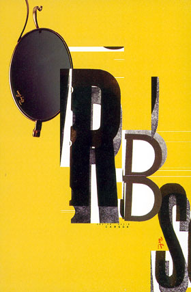
 Advertisements such as this for Kodak, and the above for Ray Ban sunglasses shed light on David Carson’s work. His interesting use of type is something he is very well known for. He was unafraid to mix sizes, fonts, weights, styles, and orientations of letters, making a statement of modernity, youth, and a laid-back atmosphere. His work for magazines, especially Ray Gun, also turned the traditional magazine design industry upside-down.

The above photograph of a spread in Ray Gun magazine, as designed by David Carson, shows the unprecedented unconventionality of his magazine design style. The bizarre placement of type goes against any and all preset rules of design, breaking them all and not bothering to create new ones. He places pictures in places most would not think for them to go. Yet somehow, this jumble of creative regurgitation still works and creates a fresh, hip vibe.
 This Ray Gun cover demonstrates the same disregard for traditional graphic design rules and determination to be set apart. His use of all lower-case letters lends an air of informality and invites the reader in as an equal. The unexpected orientation of the cover photo catches the eye of a potential reader passing a newsstand, setting Ray Gun apart from other magazines as more interesting and unique. The design of this cover conveys the overall attitude and message of the magazine, one that promotes counter and subcultures and strives to defy expectations.
David Carson is best known for his use of photography in Graphic Design and for his innovations in the field of typography. He is often referred to as the “father of grunge.” His work created standards for a new field of graphic design based in unusual typographic elements and the incorporation of photography into design. His works do more to communicate the emotion of the product, article, or whatever subject he is designing around then they do to literally display the subject. He has won several awards, including Best Overall Design (Society of Publication Designers in New York), Cover of the Year (Society of Publication Designers in New York), Designer of the Year in both 1998 and 1999 (International Center of Photography), and The most famous graphic designer on the planet, April 2004 (London Creative Review magazine). His first book, The End of Print, published in November 1995, is the best-selling graphic design book of all time, selling over 200,000 copies in 5 languages. His other books include 2nd Sight: Grafik Design After the End of Print published in 1997, Fotografiks with Phillip B. Meggs in 1999, and Trek in 2000.
Sources:
The end of print : the grafik design of David Carson / by Lewis Blackwell + David Carson.
"The History of Graphic Design" by Philip Megg
http://www.davidcarsondesign.com/?dcdc=top/s


 əˌreɪt